Last week, I detailed out how I ended up collecting the rather modest data set of about 2.72 million tweets. So after that humongous data collection exercise, the question was, now what?
While the data was being collected, I had formed some notions about what kind of analysis I would perform and how I would present the analysis. I wanted to restrict myself mostly to frequency and statistical analysis that would give me some idea of the distribution of the tweets and present these in a visually appealing form. I broke my analysis into three distinct areas:
- Analysis of the tweets and their content
- Geographical analysis of the tweets
- Analysis of the tweets vis-à-vis the characters of the TV series.
For each of these areas, I worked out some data aggregation and analysis that I could perform using a combination of SQL, Apache Pig + HBase and Ruby. While a lot of the analysis could have been done using standard SQL (after all 2.72 million isn’t exactly “Big Data”), I chose to use some of the technologies that are increasingly being associated with Big Data, just to get an understanding of the technology.
I finally visualized all that data using some nifty visualizations from D3.js to get a better feel for the data. The data can be seen in the companion micro-site and has been presented in a prior blog post.
The Summary

Summary of Tweets
These were just summary aggregates generated using MySQL scripts. I used regular expressions to detect links while I was loading the data into the MySQL table.
Tweets over Time
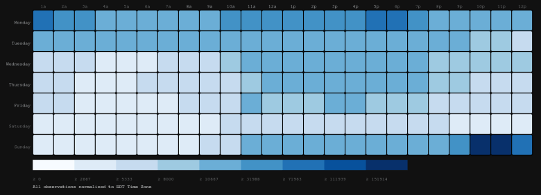
Game of Thrones aired on HBO on every Sunday night. Overall the Twitter chatter peaked on the day the episode aired and the day following the air date. Seeing a different view of the timeline actually reveals a bit more insight into this observation.
The heat map above shows the distribution of tweets over hour of the day and day of the week. All the tweets have been normalized to the EDT Time Zone so that the analysis could be put into perspective with the Time Zone in which the TV series first aired. In line with the air date and time, we see that busiest hours seem to be on Sunday immediately after the week’s episode airs in the US. A second “peak” is seen on Monday in the two hours after the episode airs in the UK. The rest of the world catches up over the week, with Saturday being a lax day. Finally the anticipation builds up again on Sunday.
The visualizations used here were built using D3.JS. NVD3.js, a D3.js based library provided the visualization for the stacked area graph. The heat map was “inspired” from this example in the D3.js example code gallery. The data was aggregated using SQL and Ruby scripts. Ruby scripts were also used to generate the JSON data needed for the visualizations.
What were people saying
What’s equally interesting is what people were saying about the show in their tweets. I was very interested in what words and by extension “hashtags” were used by people. To help understand this, I did a word frequency analysis on all the tweets using HBase and Pig and visualized it as word clouds (using D3.js) for both “hashtags” and words.
Clearly certain words stood out and underscored reactions of people to the last three episodes. Hash Tags clearly showed the three episodes viz. “The Mountain And the Viper”, “The Watchers on the Wall” and “The Children”. Other show themes like “Trial By Combat”, “Valar Morghulis” and show star characters like “Tyrion”, “Arya”, “The Mountain”, “The Viper” etc. also dominated.

A word cloud of Hash Tags
Both the word clouds were based on Jason Davies implementation of the word cloud using D3.js. This library is a fairly nifty one to visualize word clouds, but I haven’t been able to fully customize it as needed.
Who was popular
Another thing to check was what characters people were tweeting about. Here I tried to once again do a word cloud, but focussing just on the characters. Five characters clearly stood out viz. Oberyn Martell (The Red Viper), Jon Snow, Arya Stark, Gregor Clegane (The Mountain) and everyone’s favourite Tyrion Lannister.
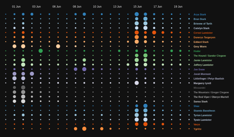
To get a more qualitative feel of character mentions, I tried to look at volume of mentions per character. Here too some clear trends stood out:
- The final episode very neatly tied up the character story arcs for most of the many characters in this show. Naturally, a significant number of characters saw a high number of mentions in the last episode.
- Ygritte and Jon Snow, both saw the highest number of mentions in the episode “The Watchers on the Wall”, since that episode almost exclusively focused on their part of the Game of Thrones universe
- Oberyn Martell and The Mountain, naturally saw the maximum number of mentions in the episode “The Mountain and The Viper”, which featured their epic showdown
The character cloud was once again based on Jason Davies word cloud implementation. The character “tweet count by day” chart was based on another example from the D3.js examples page called “Publications in Journals over Time” by Asif Rahman.
Where were people tweeting from
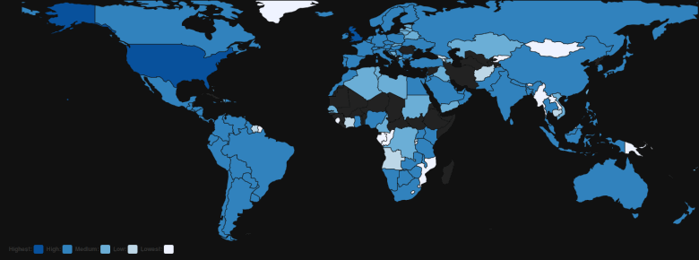
What was equally interesting was where people were tweeting from. Unfortunately, location data is not often available in tweets and in this case a mere 3-4% of tweets had geo-location data. Nevertheless, even this amounted to a fairly decent number of data points. I took this data and I did a kind of a “choropleth” world map that is shaded by number of tweets. This map was based on the “datamaps” library by Mark DiMarco and is an excellent library for these kind of mapping visualizations.
The first thing that I noticed is the sheer popularity of this show. Tweets had poured in from all over the globe, including those that appeared to be gibberish from a ship!!!
The overall distribution of tweets was also indicative of the fact that the show was immensely popular in the US and UK, which was something I noticed in the timeline data as well.
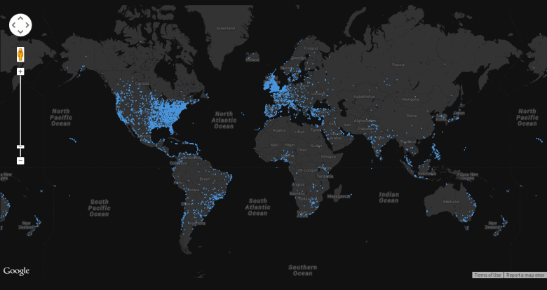
I also plotted all the points on an interactive Google Map that you can see here. I used CSS to style the map to that wonderful grey color that went well with the rest of the visualizations. Initially, I tried loading all the data points using a GeoJSON layer, but that proved to be very slow. So sacrificing some control over the look, I eventually opted to use Fusion Tables with Google Maps for this.
So What Next?
So far I have had an interesting month learning all this new stuff, and also playing around with data visualization. One of the things I missed here was actually storing the tweets in a database or in as system designed to handle the kind of volumes that would be seen in a real life use case. So as a next step, I plan on learning and moving to Mongo DB or some other similar data store that would serve me better than just using a flat file.
Also, a lot of the analysis that was presented here was done in a semi-manual fashion. I’d really want to automate this entire process so that it becomes seamless from data collection to visualization. As an end goal would ideally love to see this evolve as platform to solve some domain specific data visualization problems. I’ll keep updating this blog as and when I make progress on this, so do watch this space for more.


